Layering Bracelets: A Beginner-Friendly Guide
Why Bracelet Layering Looks Harder Than It Actually Is
I put off trying layered bracelets for years because every tutorial I saw made it look like you needed a degree in design theory to pull it off. Rules about metal mixing, texture balancing, color coordination, proportion scaling — it felt like there was a wrong answer hiding behind every choice.
Then one morning I was running late, grabbed three bracelets I liked individually, and put them all on the same wrist without thinking about it. They looked fine. Not magazine-ready, but genuinely good. That's when I realized most of the "rules" around bracelet layering are guidelines at best and gatekeeping at worst. The basics are simple, and the rest is just personal preference.
This guide is for people who want to start layering bracelets but feel intimidated by the apparent complexity. Spoiler: it's not that complicated, and you probably already own enough to get started.
The Three-Bracelet Rule (and When to Break It)
If there's one number to remember, it's three. Three bracelets on one wrist is the sweet spot for most people and most occasions. It's enough to create visual interest without looking cluttered. Two can feel like you forgot one. Four or more starts getting into costume territory, which has its place but isn't the best starting point.
The reason three works so well has to do with visual balance. An odd number creates a natural center point — your eye lands on the middle bracelet and then moves outward, which feels more dynamic than the static symmetry of two. This isn't some esoteric design theory. It's just how human perception works with grouped objects.
That said, I've seen five-bracelet stacks look incredible on people with slender wrists. And I've seen three-bracelet stacks look overloaded on someone with a smaller frame. Your wrist size and hand proportions affect how many bracelets you can carry. If you're not sure, start with three, check a mirror, and adjust from there.
Understanding Bracelet Types for Layering
Not all bracelets play well together. Mixing the wrong types can result in tangling, scratching, or just a messy visual effect. Here's a breakdown of the main categories and how they interact:
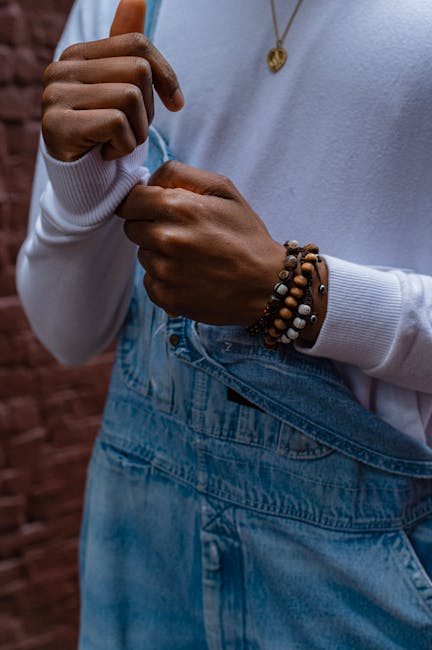
Chain Bracelets
Thin chain bracelets are the backbone of most layered looks. They're lightweight, take up minimal wrist space, and come in every metal tone. A 2mm to 4mm chain width is ideal for layering — wide enough to be visible but narrow enough that multiple chains don't compete.
Chain bracelets tangle with each other more easily than other types. If you're wearing three chain bracelets, try to vary the chain styles — a cable chain, a box chain, and a rope chain, for example. Different link shapes reduce tangling because they don't interlock the way identical chains do.
Beaded Bracelets
Stone bead bracelets, wood bead bracelets, and glass bead bracelets each bring texture and color to a stack. The standard bead size for most commercial bracelets is 8mm, which works well alongside chain bracelets without overwhelming them.
Beaded bracelets are probably the easiest type to layer because they have a distinct visual identity. One beaded bracelet stands out in a stack of chains. Two beaded bracelets next to each other can work if the bead colors or materials contrast — black onyx next to natural wood, for example. Two similar beaded bracelets next to each other tend to look redundant rather than intentional.
Cuff Bracelets
Cuffs are the structural anchors of a bracelet stack. They're wider, firmer, and visually heavier than chains or beads. One cuff per wrist is usually enough — they take up significant space and can crowd out thinner bracelets if you try to squeeze too many alongside them.
The best placement for a cuff is usually on the outside of your wrist (the thumb side when your palm faces down). This creates a visual frame — the cuff on the outside, thinner pieces toward the inside. If you wear a watch on your left wrist, a cuff on the outside of your right wrist creates a balanced overall look.
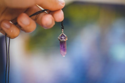
Leather and Cord Bracelets
Leather wrap bracelets and woven cord bracelets add a casual, textured element that contrasts nicely with metal. A single leather bracelet in a stack of metal chains breaks up the monotony and adds warmth.
Be aware that leather can transfer color to lighter metal finishes over time, especially if you wear the stack in humid conditions or during exercise. It's not a major issue for everyday wear, but it's worth knowing if you're layering a light-colored silver chain against a dark leather cord.
Mixing Metals: The Practical Reality
The old rule was "never mix gold and silver." That rule is dead, and it has been for years. Mixed metal jewelry is one of the more enduring styling developments of the past decade, and it makes practical sense — most people own both gold and silver jewelry, and restricting yourself to one metal per outfit is unnecessarily limiting.
The approach that works most reliably: make one metal dominant. If you're wearing five pieces total, three in one metal and two in another reads as intentional mixing. Two and two can look like you forgot to match. One and four just looks mismatched.
There are a few combinations that are harder to pull off. Rose gold with yellow gold can look muddy if the shades are similar — they're close enough that the difference reads as a mistake rather than a choice. Rose gold with silver, however, creates a clear contrast that works well. Yellow gold with silver is the classic mix and probably the easiest to style because the two tones are so distinct.
Color Coordination Without Overcomplicating Things
If your bracelets include colored elements (stones, beads, enamel), coordination helps but doesn't need to be precise. You're not building a color wheel diagram. You're just making sure the colors don't fight each other.
The simplest approach: pick one color to anchor the stack and keep everything else neutral. A single blue stone bracelet with two silver chains, for example. The blue adds interest, the silver provides unity, and the overall effect is clean.
If you want to use multiple colors, stick to analogous colors (next to each other on the color wheel) or complementary pairs. Blue and green work together. Blue and orange create deliberate contrast. Red and pink next to each other can look confused because they're too close but not quite the same. Red and green together can feel holiday-themed unless you're going for that specifically.
Earth tones — browns, greens, tans, warm grays — are almost foolproof for bracelet layering because they naturally harmonize. This is why wooden bead bracelets and natural stone bracelets are so popular in stacks. They play well with everything.
Proportion and Spacing
The physical arrangement of bracelets on your wrist matters more than most people realize. Tight, bunched-up bracelets look different from loosely spaced ones, even if the pieces are identical.
A common mistake is wearing all bracelets at the same tightness. Varying the fit creates a more natural, relaxed look. Wear one bracelet snug against the wrist, one slightly loose, and one in between. The variation in how they sit adds visual depth without any extra effort.
Spacing also matters between the bracelets themselves. If every bracelet is pressed directly against its neighbor, the stack looks dense and heavy. Leaving small gaps — even just a few millimeters — lets each piece breathe and be appreciated individually.
Considering Your Watch
If you wear a watch regularly, it becomes part of your bracelet stack whether you intend it to or not. The watch face acts as a focal point, and the bracelets should complement it rather than compete.
For metal watches, match your bracelet metals to the watch case. A silver watch with silver bracelets looks cohesive. A gold watch with gold bracelets does the same. If your watch has both gold and silver elements (two-tone), you have built-in permission to mix metals on that wrist.
For sport watches with rubber or resin bands, lean toward casual bracelet materials — leather, cord, or beaded pieces. Metal chains against a sport watch can look mismatched unless the watch itself has significant metal elements.
One practical consideration: wear your watch first, then add bracelets. The watch should sit in its natural position on your wrist, and the bracelets fill the remaining space. Trying to fit a watch into a stack that's already on your wrist usually results in an uncomfortable arrangement.
Common Beginner Mistakes and How to Avoid Them
Too many textures at once. Mixing chains, beads, leather, and cuffs all on the same wrist can look chaotic rather than curated. Start with two types and add a third once you're comfortable. Chains plus beads is the most versatile starting combination.
Ignoring comfort. A stack that looks great but pinches, pulls hair, or feels heavy is a stack you'll take off within an hour. Test your stack by wearing it around the house for 30 minutes before committing to it for an event.
Matching too precisely. Three identical bracelets in the same metal look like a set, not a stack. The whole point of layering is variety. Even slight differences — one chain slightly thicker, one bead slightly darker — make the stack more interesting.
Forgetting about sleeves. Long sleeves will hide your bracelet stack entirely. If you're layering bracelets for a specific outfit, check whether the sleeves will cover them. Bracelets under a sweater cuff serve no visual purpose.
Building Your First Stack: A Step-by-Step Approach
Start with one bracelet you already love wearing. This is your anchor piece. It could be anything — a chain, a beaded bracelet, a leather wrap. The specific piece matters less than the fact that you already like how it looks on your wrist.
Add a second bracelet that contrasts with the first in at least one way. If the first is metal, the second should be beaded, leather, or a different metal. If the first is colorful, the second should be neutral. If the first is thin, the second should be wider (or vice versa).
Add a third bracelet that bridges the other two. If your first two are silver chain and wooden beads, a third piece with both metallic and warm elements — maybe a chain with a wooden pendant — ties the stack together.
Check the mirror. Adjust spacing. Move pieces around until they feel balanced. There's no single correct arrangement, so trust your eye. If it looks good to you, it's good.


Comments