My Jewelry Photos Looked Terrible on Instagram — Here's What I Changed
My Jewelry Photos Looked Terrible on Instagram — Here's What I Changed
I started making jewelry about two years ago — just simple beaded bracelets at first, then wire-wrapped rings, then more involved stuff with stones and metalwork. The pieces themselves were decent. I was proud of them. But every time I posted a photo on Instagram, it looked... flat. Washed out. Like the jewelry had lost all its personality somewhere between my hands and the screen. Meanwhile, I'd scroll past other makers' accounts and their pieces practically glowed — warm, detailed, inviting. Same platform, same phone, completely different results.
I spent months experimenting with setups, angles, lighting, editing apps. I made every mistake in the book — and then some. Eventually I figured out a workflow that actually works, one that makes my jewelry look the way it looks in real life (or better). This guide is everything I learned, laid out so you don't have to go through the same frustrating trial-and-error process I did.
Why Jewelry Photography Actually Matters on Instagram
Instagram is a visual platform, which is obvious, but the implication for jewelry makers is worth spelling out: people can't touch your jewelry through a screen. They can't pick it up, feel the weight, examine the detail, see how the light catches the surface. The photograph is the entire experience. If your photo doesn't convey quality, craftsmanship, and attention to detail, the viewer assumes the jewelry itself lacks those qualities — even if it doesn't.
Good photography builds trust. It tells potential customers that you care about every aspect of your work, including how you present it. It also gives people a reason to stop scrolling, which on Instagram is arguably the hardest thing to achieve. A well-lit, well-composed jewelry shot stands out in a feed the same way a well-styled window display stands out on a street. And for those of us selling through Instagram — whether directly through DMs, a link in bio, or an integrated shop — better photos translate directly to more inquiries and more sales.
What You Actually Need (Equipment Guide)
The good news: you do not need expensive equipment to take great jewelry photos. I took some of my best-performing photos with my phone. But there's a difference between "you can do it with your phone" and "any photo from your phone will work." Let's break it down.
Camera: Phone vs. Dedicated Camera
Modern smartphones — anything from the last three or four years — are genuinely excellent for jewelry photography. The iPhone's Portrait mode, Samsung's Pro mode, Google's computational photography — they all produce sharp, well-exposed images that are more than sufficient for Instagram. The main advantage of a phone is convenience: it's always with you, the files are ready to post immediately, and the editing apps are optimized for mobile.
A dedicated camera (mirrorless or DSLR) gives you more control over depth of field, manual focus, and RAW file processing. If you already own one and know how to use it, great — use it. But don't buy a camera specifically for Instagram jewelry photography unless you're also shooting for a website, print materials, or wholesale catalogs where higher resolution matters. For Instagram's 1080×1350 pixels, your phone is plenty.
Tripod
This is the one piece of equipment I'd call non-negotiable. Handholding your phone two inches above a tiny ring is a recipe for blurry photos and frustration. A small tabletop tripod or phone mount lets you position your camera precisely, keep it still, and take multiple shots without the composition shifting between attempts. I use a cheap flexible-leg tripod that I got for about twelve dollars. It's not fancy, but it holds my phone steady at any angle.
The tripod also enables focus stacking — taking multiple shots at slightly different focus points and combining them for sharper detail throughout. More on that in the editing section.
Reflector
A small reflector (even a piece of white foam board) fills in shadows and adds sparkle to metallic surfaces. Jewelry is reflective, which means it picks up the colors of whatever is around it. A white reflector bounces clean, neutral light back into the piece. A piece of aluminum foil (crumpled slightly for a softer effect) can add interesting specular highlights. You don't need a professional photography reflector — a white poster board or even a blank sheet of paper will do the job.
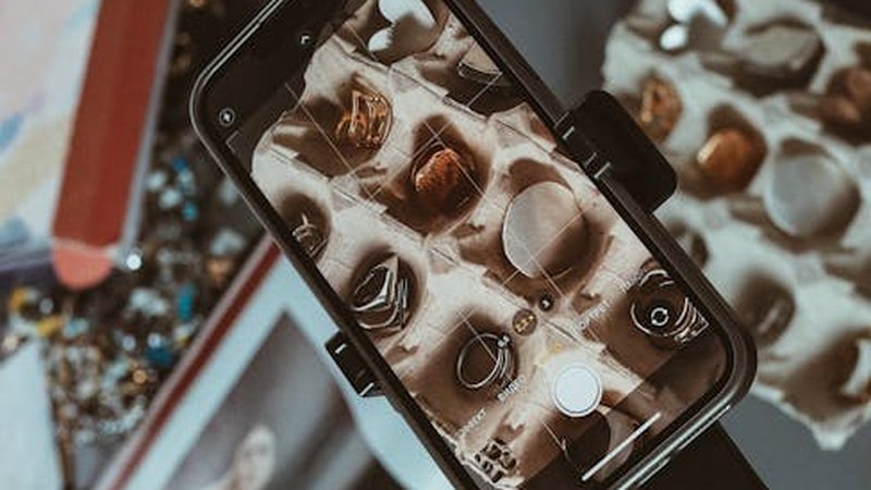
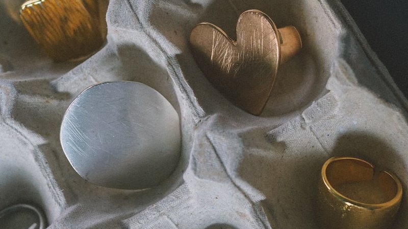
Macro Lens Attachment
This is optional but genuinely helpful if you're photographing very small pieces or intricate details. Clip-on macro lenses for phones cost ten to twenty dollars and let you focus much closer than the built-in lens allows. I use one for photographing ring details and stone inclusions. The quality varies by brand, so read reviews before buying — the super cheap ones tend to add distortion and chromatic aberration around the edges.
Setting Up Your Scene: Lighting and Background
Natural Light Is Your Best Friend
I tried artificial lighting setups — ring lights, softboxes, desk lamps with daylight bulbs — and while they can work, natural window light consistently produces the most flattering results for jewelry. The quality of light from a window (especially indirect light on an overcast day, or light from a north-facing window) is soft, even, and has a color temperature that makes metals look warm and stones look vivid.
Here's my setup: I place a small table next to a large window. I use a white foam board on the opposite side of the jewelry to bounce light back and fill shadows. I shoot during mid-morning or late afternoon when the light is bright but not harsh. Direct sunlight creates hard shadows and blown-out highlights — you want soft, diffused light. If the sun is streaming directly onto your shooting area, hang a sheer curtain over the window to diffuse it.
If you don't have good window light (maybe you work in a basement studio or your windows face a wall), you'll need artificial light. A single LED panel with a diffuser, positioned at a 45-degree angle to your jewelry, is the simplest workable setup. Avoid overhead lighting — it creates unflattering shadows under rings and pendants.
Background Choices That Don't Distract
The background should complement the jewelry, not compete with it. Here are options that work well:
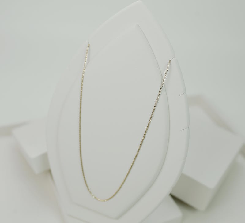
White or light gray: Clean, professional, lets the jewelry speak for itself. Use white printer paper, a white cutting board, or a light gray piece of fabric. This is the safest choice for product shots.
Marble contact paper: Wrapping a piece of foam board in marble-print contact paper gives you an elegant surface for pennies. It photographs beautifully and suggests luxury without being over-the-top.
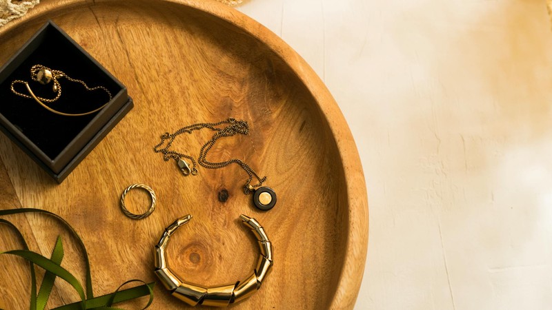
Wood surfaces: A piece of driftwood, a cutting board, or a wooden table with nice grain adds warmth and an organic feel. Works especially well for earthy, natural stone jewelry.
Fabric: Linen, burlap, or velvet in neutral colors (cream, soft gray, muted tan) create depth and texture. Velvet is particularly nice because its matte surface absorbs light and makes metallic jewelry pop by contrast.
What to avoid: busy patterns, bright colors, reflective surfaces (they create confusing reflections), and anything with text or logos. The background is supporting cast, not the star.
Composition: Making the Shot Interesting
Good composition separates a "product photo" from an "Instagram-worthy shot." Here are the angles and arrangements I use most:
The 45-Degree Flat Lay
This is probably the most common jewelry photography angle on Instagram, and for good reason — it works. Position your camera at roughly 45 degrees above the jewelry, looking down. This shows the top surface and one side of the piece, giving a sense of dimension. It's particularly effective for bracelets (lay them in a gentle curve, not a straight line) and earrings (angled slightly toward the camera).
For this shot, I like to add a subtle prop — a sprig of dried flowers, a crystal, a paint swatch in a coordinating color — placed near but not touching the jewelry. The prop adds visual interest and context without stealing focus.
The Close-Up Detail Shot
Get as close as your lens will focus. Show the texture of a stone, the hammer marks on a hand-forged ring, the individual beads in a necklace. Detail shots serve two purposes: they prove the quality of your craftsmanship (handmade texture is a selling point, not a flaw), and they create visual variety in your feed when mixed with wider shots.
For detail shots, I use my phone's portrait mode or a macro lens attachment. I tap the screen to set focus exactly where I want it — usually on the most interesting part of the piece — and then slightly adjust the exposure by dragging the sun icon up or down.
The Styled Scene
This is where you build a small scene around the jewelry. A ring resting on an open book. A necklace draped over a vintage perfume bottle. Bracelets stacked on a wrist (yours or a model's). This type of shot tells a story and helps viewers imagine the jewelry in their own life. It's more editorial and less product-photography, which tends to perform well on Instagram because it feels aspirational.
Keep styled scenes simple. Two or three elements maximum, all in a cohesive color palette. A cluttered scene looks messy, not artistic. I plan my styled shots the same way I plan my jewelry designs — start with one focal element and build around it sparingly.
Shooting Different Materials: What Works for What
Not all jewelry photographs the same way. The techniques that make a silver ring look great might make a matte stone bead look flat. Here's what I've learned about photographing different materials:
Metal (Silver, Gold, Rose Gold)
Metals are reflective, which is both the challenge and the opportunity. They pick up every color in their environment and show every smudge and fingerprint. Before shooting any metal piece, wipe it down with a microfiber cloth — seriously, this makes a visible difference. For the photo itself, position your reflector carefully to control what the metal reflects. You want it reflecting white (your foam board) or a soft gradient, not your face, your ceiling, or a colored wall. The "hero reflection" — a clean band of white light running along a curved surface — is what makes metal jewelry look professional in photos.
Gemstones and Crystals
The whole point of a gemstone is how it interacts with light — its fire, brilliance, color depth. To capture this, you need a light source that creates sparkle without washing out the color. Natural window light works beautifully. Position the stone so light enters from one side and you're shooting from a slight angle — this shows the internal color and any inclusions while catching some of the surface sparkle. For dark stones (garnet, sapphire, amethyst), you might need to increase exposure slightly so the stone doesn't turn into a black hole in the photo. For light stones (citrine, aquamarine, clear quartz), watch out for overexposure — the facets can blow out to pure white easily.
Pearls
Pearls have a soft, diffused luster that's notoriously hard to photograph. Harsh light kills it — you get bright spots and no depth. Soft, even lighting is essential. I photograph pearls on an overcast day or with a heavily diffused light source. A slightly warm white balance (not too cool, not too yellow) brings out their natural warmth. Avoid strong shadows — pearls look best when the light wraps around them evenly.
Beads and Stone Chips
Natural stone beads and chip-style jewelry have texture that you want to highlight. A slightly angled side light creates shadows between beads and shows the surface texture of each individual piece. Flat, even lighting makes beaded jewelry look two-dimensional. I usually position my shooting table so the window light comes from the side rather than straight on. The resulting shadows give depth and make the bracelet or necklace look three-dimensional in the photo.
Leather and Fabric Elements
If your jewelry incorporates leather cord, macramé, or fabric, the texture is the selling point. Get close and show the weave, the grain of the leather, the stitching. Side lighting again is your friend here — it emphasizes texture that front lighting would wash out. For leather specifically, a very light application of leather conditioner before shooting can darken it slightly and bring out the grain without making it look oily.
Phone Photography Tips That Actually Make a Difference
Since most of us are shooting on phones, here are the specific phone settings and techniques that improved my jewelry photos:
Lock focus and exposure. Tap and hold on your subject until "AE/AF Lock" appears. This keeps your focus and exposure from jumping around when you slightly reposition or when a cloud passes over the sun. It's the single most useful phone photography tip I know.
Adjust exposure manually. After tapping to focus, the sun icon appears next to the focus box. Drag it up or down to brighten or darken the image. For jewelry, I often slightly underexpose (drag down a tiny bit) to preserve highlights on metallic surfaces. You can brighten shadows in editing, but blown-out highlights are gone forever.
Use the grid overlay. Turn on your camera's grid lines and use the rule of thirds. Place the jewelry at an intersection point rather than dead center — it creates a more dynamic composition. This isn't a hard rule, but it's a good default when you're not sure about placement.
Clean your lens. I know, I know. But phone lenses get smudged constantly, and a smudged lens creates a soft, hazy effect that makes jewelry look fuzzy. Give it a quick wipe with your shirt before every shooting session. It takes one second and makes a real difference.
Don't use digital zoom. Digital zoom on phones just crops and enlarges the image, losing detail. Instead, move your phone physically closer to the jewelry, or use a clip-on macro lens. If you must crop, do it in editing where you have more control.
Try Portrait mode for depth. If your phone has Portrait mode, experiment with it for jewelry. It creates a natural-looking depth of field blur that separates the jewelry from the background. It works best with pieces that have some height — rings, pendants, stacked bracelets. Flat pieces like a single bracelet laid on a surface might confuse the depth detection. Adjust the aperture setting (f-stop) after taking the shot — a higher number (f/8, f/11) keeps more of the scene in focus, while a lower number (f/1.4, f/2.8) creates more blur.
Shoot in RAW if possible. Many newer phones offer RAW capture (sometimes called Pro mode). RAW files contain more image data than JPEGs, which gives you more flexibility in editing — you can recover shadows, adjust white balance more precisely, and push contrast without introducing banding or noise. The trade-off is larger file sizes and the need for a RAW-compatible editing app (Lightroom Mobile, Snapseed, or VSCO all handle RAW).
Editing: Less Is More (But Not Zero)
Post-processing is where good photos become great photos, but it's also where people go wrong. Over-edited jewelry photos — over-saturated, over-sharpened, weird color casts — look worse than unedited ones. Here's my editing workflow, which takes about two minutes per photo:
Step 1: Straighten and crop. Even a slight tilt looks unprofessional. Use the straighten tool to level your horizon line, then crop to your desired aspect ratio. For Instagram, I crop to 4:5 (1080×1350) — it takes up more screen space than a square and gives a more editorial feel.
Step 2: Adjust white balance. Jewelry colors need to be accurate. If your white gold looks yellow or your rose gold looks orange, fix the white balance first. Most editing apps have a temperature slider — move it toward blue to cool down, toward yellow to warm up. I also use the tint slider if the image looks too green or too magenta.
Step 3: Set your black and white points. Drag the shadows slider down until the darkest parts of your image are truly black (not gray), and drag the highlights slider up until the brightest parts are bright but not blown out. This creates a full tonal range that makes the image look crisp and professional.
Step 4: Add a touch of contrast. A small contrast increase (10-15%) makes jewelry pop. Don't overdo it — too much contrast crushes the midtones and makes details disappear. If your app has a "dehaze" slider, a tiny bump there can add clarity to metallic surfaces.
Step 5: Sharpen selectively. Sharpening makes edges crisp, which is great for showing facet lines, texture, and detail. But too much sharpening creates a harsh, artificial look and amplifies noise. I use a light sharpening pass (20-30%) and sometimes paint sharpening onto just the jewelry using a masking brush, leaving the background soft.
Step 6: Color adjustments. I rarely change colors dramatically, but I might boost saturation by 5-10% to make stones look more vivid, or adjust individual color channels (HSL panel in Lightroom) to fine-tune a specific hue. If a gemstone looks slightly too blue, I'll shift it toward the accurate color. The goal is accuracy, not drama.
On Filters
Pre-made filters are tempting because they're one tap, but most of them aren't designed for product photography. They shift colors in ways that make jewelry look unnatural — warm filters make silver look gold, cool filters make gold look silver. If you use a filter, choose a subtle one and then manually adjust the temperature back to neutral. Or better yet, skip the filter entirely and make manual adjustments. Your jewelry will look more true-to-life, and that builds more trust with potential customers.
Instagram-Specific Technical Details
Instagram compresses every image you upload, which means a perfectly edited photo can look slightly softer or less vibrant after posting. A few technical optimizations help minimize this:
Optimal dimensions: Instagram displays images at 1080 pixels wide. Upload at exactly this width (or 1080×1350 for portrait orientation) to avoid unnecessary compression. If you upload a 4000-pixel image, Instagram downscales it and the result can look worse than if you'd uploaded at the display size. I resize in my editing app before uploading.
File format: JPEG is fine for Instagram. If you shot in RAW, export as a high-quality JPEG (80-90% quality). PNG doesn't offer visible benefits on Instagram and can actually look worse after compression due to the way Instagram processes different formats.
Aspect ratio: Instagram supports 1:1 (square), 4:5 (portrait), and 16:9 (landscape). For jewelry, 4:5 is almost always the best choice — it uses the most screen real estate and feels premium. Save 1:1 for grid consistency if that's your aesthetic, and avoid 16:9 for single product shots (too much wasted space above and below the jewelry).
The Carousel Strategy: Planning a 9-Photo Grid Post
Carousel posts get more engagement than single images on Instagram — people swipe, spend more time on the post, and the algorithm rewards that. Here's how I plan a 9-photo carousel for a jewelry piece:
Slide 1 — The Hook: The most visually striking shot. This is your scroll-stopper, so make it count. Usually a styled scene shot or a beautiful flat lay with good light. This image needs to work at thumbnail size because it's what people see before they click.
Slide 2 — The Product Clean: A clear, straight-on product shot on a clean background. This shows the full piece without distractions. Think of it as the "catalog shot" — the one that answers "what exactly am I looking at?"
Slides 3-4 — Detail Shots: Close-ups showing texture, craftsmanship, stone quality, clasp details. Two or three detail shots give viewers a virtual "pick it up and examine it" experience. I focus on the most interesting elements — a particularly nice stone, hand-stamped text, unique texture.
Slide 5 — On-Body or In-Context: A shot of the jewelry being worn or in a real-life context. This helps with scale (how big is it really?) and gives viewers a sense of how it looks when worn. A hand wearing rings, a wrist with bracelets, a neckline with a pendant.
Slides 6-7 — Alternate Angles: Shots from different angles — back view, side view, a slightly elevated angle. Jewelry looks different from every direction, and showing multiple angles builds confidence that the buyer knows what they're getting.
Slide 8 — Process or Story: A behind-the-scenes shot — your workspace, tools, materials, work-in-progress. This adds personality and helps justify pricing by showing the handmade process. People love seeing how things are made.
Slide 9 — Call to Action: A simple image with text overlay — price, sizing info, how to order. Or a shot of the packaging. Something that makes the next step clear. "DM to order," "Link in bio," "Available in shop." Keep the text minimal and elegant.
Not every carousel needs all nine slides. Five to seven is often plenty. But planning a multi-slide post forces you to create a variety of shots, and that variety keeps viewers swiping — which is the whole point.
A Final Thought: Consistency Beats Perfection
The jewelry accounts I admire most on Instagram aren't the ones with the most technically perfect photos. They're the ones with a consistent look — a recognizable editing style, a cohesive color palette, a consistent background. When someone scrolls through their feed and immediately recognizes your post before seeing your username, that's when you know your photography has a brand identity. And that brand identity is worth more than any single perfect shot.
Don't chase perfection on every post. Chase consistency. Develop a setup, a process, and an editing routine that you can repeat quickly. The faster you can produce good photos, the more consistently you can post, and consistent posting is what builds an audience on Instagram. Your photography skills will improve naturally over time — they always do — but consistency is something you can choose to prioritize right from the start.
Comments