How to match crystal jewelry with your outfit color palette
Why this is harder than it looks
Matching clothes to jewelry seems straightforward until you actually stand in front of a mirror with five different necklaces and a top you are not sure about. The problem is that crystals are not flat colors — they are translucent, refractive, and often multicolored in a single stone. An amethyst pendant does not just look "purple." It shifts between lavender, deep violet, and occasional flashes of red depending on the light, the angle, and what you are wearing underneath it.
This is actually what makes crystal jewelry more interesting to style than plain metal or uniformly colored accessories. But it also means that strict color theory rules do not always apply the way they do with fabrics and paints. The guidelines below are practical, not academic. They come from what actually works on real bodies in real lighting, not from a color wheel textbook.
The complementary color shortcut
Color theory 101 says that complementary colors — the ones directly opposite each other on the color wheel — create maximum contrast and visual pop. Red and green. Blue and orange. Yellow and purple. In practice, this works with crystal jewelry but requires some restraint.
A small amethyst pendant (purple) against an olive green sweater is striking. A massive amethyst statement necklace against the same sweater looks like you are going to a Mardi Gras party. The size of the stone matters as much as the color combination. For complementary pairing to work in an everyday context, keep the stone small and let the contrast be a subtle detail rather than a dominant visual element.
Blue stones like sapphire and lapis lazuli look electric against warm orange and peach tones. This is a combination that works surprisingly well for autumn outfits — a burnt orange cardigan with a small lapis stud earring is the kind of detail that looks intentional without screaming for attention.
The exception to the "keep it subtle" rule is formal occasions. A red garnet necklace against a dark green dress at a holiday event is classic and dramatic. In that context, the boldness is the point. Save maximum complementary contrast for when the setting supports it.
Analogous colors: the safe and elegant route
Analogous colors sit next to each other on the color wheel. Blue, blue-green, and green. Red, orange-red, and orange. This combination is harmonious by nature and almost impossible to get wrong.
For crystal jewelry, this means pairing stones with outfits in the same color family. A turquoise pendant with a teal blouse. A citrine (yellow-orange) ring with a warm amber cardigan. A rose quartz (pink) bracelet with a dusty rose dress. These combinations feel cohesive and polished without requiring any color theory knowledge — they just look right.
The analogous approach is particularly effective for monochrome or tonal outfits. If you are wearing different shades of blue from head to toe, a blue stone ties the whole thing together. If you are wearing all neutrals, a warm-toned stone like citrine or carnelian adds a subtle warmth that makes the neutral palette feel intentional rather than accidental.
Neutral outfits and the power of one color pop
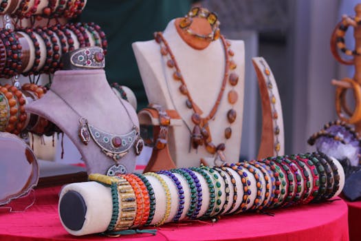
All-black, all-white, all-gray, all-beige — neutral outfits are a blank canvas for crystal jewelry, and this is where stones really get to shine. A single colored crystal against a neutral background is one of the easiest and most effective styling moves available.
Black is the most versatile neutral for jewelry. Nearly any crystal looks good against black because the dark background provides maximum contrast and lets the stone's color do all the talking. Amethyst against black is rich and elegant. Citrine against black is warm and eye-catching. Rose quartz against black is soft but present. Clear quartz or diamond against black is classic for a reason.
White and cream are trickier because the contrast is lower. Light-colored stones like clear quartz, moonstone, and white sapphire can disappear against a white blouse. For white outfits, go with darker or more saturated stones — garnet, lapis lazuli, or deep green malachite. The contrast makes both the outfit and the jewelry more interesting than either would be alone.
Gray is the underrated neutral. It provides enough contrast for medium-toned stones without the severity of black or the washout risk of white. Amethyst, labradorite, and blue lace agate all look excellent against gray.
Warm stones for warm tones, cool stones for cool tones
This is the simplest matching rule that actually works most of the time. Look at the dominant tone of your outfit. Is it warm (yellow, orange, red, brown, olive) or cool (blue, purple, gray, emerald green, pink)? Match the stone's temperature to the outfit's temperature.
Warm stones: Citrine, amber, carnelian, sunstone, tiger's eye, golden topaz, and red jasper. These have yellow, orange, or red undertones that harmonize naturally with warm clothing. A burnt sienna dress with a citrine pendant is a combination that feels effortless because the colors are in the same temperature family.
Cool stones: Aquamarine, sapphire, amethyst, lapis lazuli, blue lace agate, iolite, and moonstone. These have blue, purple, or gray undertones. A navy blue suit with a small aquamarine brooch is the kind of detail that looks polished without trying hard.
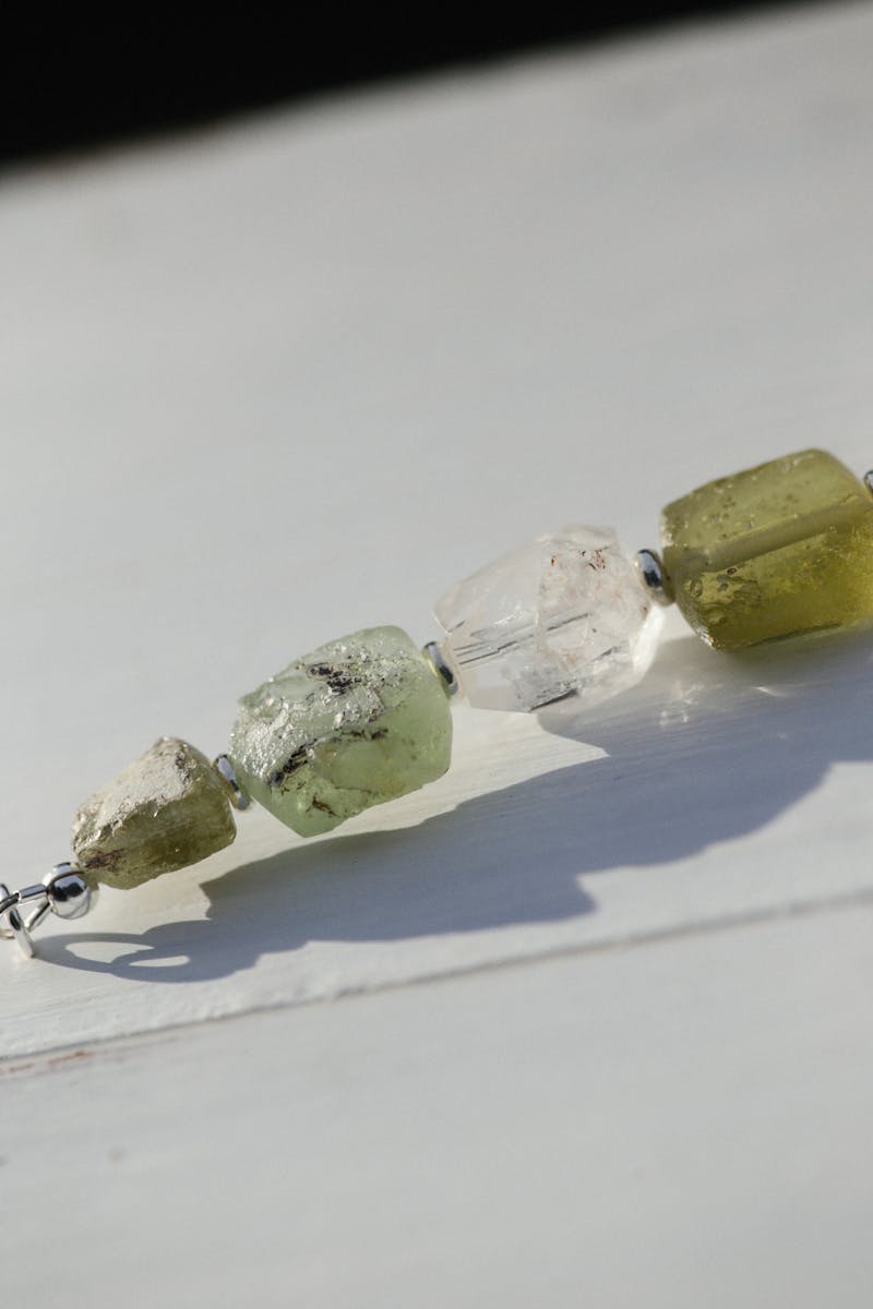
What about stones that are both? Some crystals sit in the middle. Opal can flash warm and cool colors simultaneously. Tourmaline comes in every color. Labradorite shifts between gray, blue, and gold depending on the angle. These chameleon stones work with almost any outfit temperature, which is part of why they are so popular in jewelry design.
The main mistake people make here is forcing a mismatch. A bright warm citrine against a cool ice-blue outfit creates visual tension that can look jarring. It is not impossible to pull off — fashion has no absolute rules — but it requires confidence and usually works better as a deliberate contrast statement than an accidental pairing.
Monochrome outfits: use texture instead of color
When your outfit is already one color from top to bottom, adding another color via jewelry is not your only option. You can also add texture, which creates visual interest without breaking the monochrome palette.
Raw or rough-cut crystals against smooth fabric create a compelling texture contrast. A chunk of raw rose quartz on a black silk blouse, or an uncut amethyst geode slice on a simple white tee — the organic irregularity of the stone against the clean geometry of the fabric is visually engaging in a way that polished stones are not.
Faceted stones catch and scatter light differently than cabochons (the smooth dome cut). A faceted clear quartz pendant against a white cotton shirt will throw tiny rainbows in direct light, adding sparkle without adding color. A cabochon moonstone in the same setting would give you a smooth, milky glow instead. Same neutral palette, completely different effect.
The universal stones that go with everything
If you want to own one piece of crystal jewelry that works with 90 percent of your wardrobe, pick something from this list.
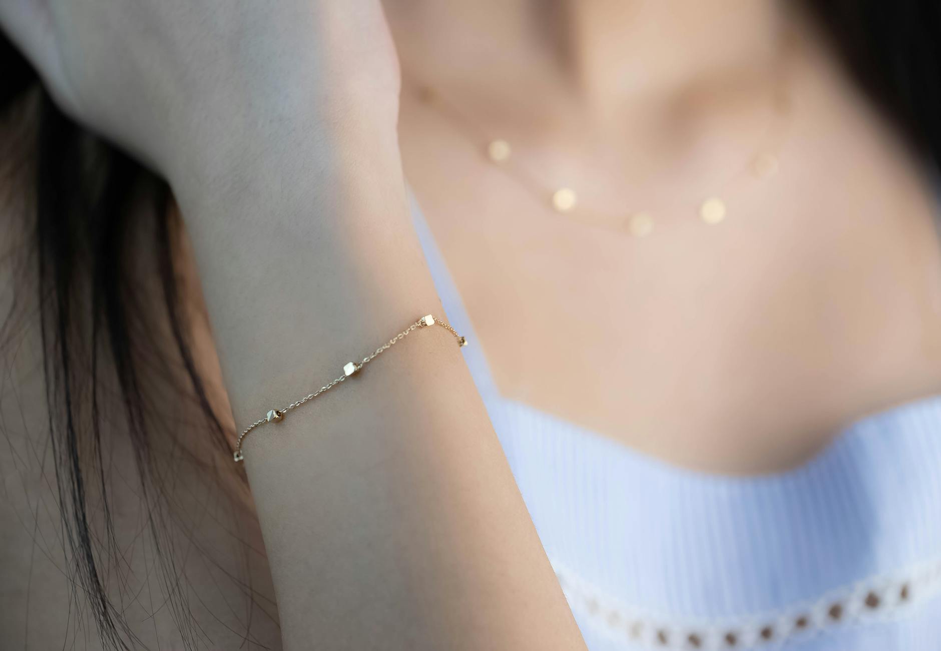
Clear quartz: The most versatile stone in existence. It is essentially colorless, so it acts like a diamond substitute at a fraction of the price. Works with every color, every temperature, every formality level. A clear quartz pendant on a thin silver chain is the "goes with everything" champion.
White moonstone: Has a subtle blue-white sheen called adularescence that adds a gentle glow without competing with outfit colors. Particularly good with dark outfits where the sheen shows up more dramatically.
Pearl: Not a crystal in the mineralogical sense, but widely grouped with gemstone jewelry. Pearls have been a universal accessor for centuries because they genuinely work with everything. White pearls are the most versatile. Black pearls (Tahitian) are excellent for dark outfits and formal settings.
Gray labradorite: The flash in labradorite means it picks up and reflects nearby colors, making it surprisingly adaptive. Against a blue shirt, the blue flashes dominate. Against a green dress, the green tones come forward. It is a stone that collaborates with your outfit rather than fighting it.
The stones that are hard to style
Not every crystal is easy to wear. Some are genuinely challenging to match with clothing, and knowing which ones they are saves a lot of morning frustration.
Bright red stones (ruby, red coral, bright garnet): Red is aggressive. A small ruby stud is fine. A large red pendant or multiple red pieces can make an outfit look holiday-themed regardless of the season. Red works best against neutral backgrounds — black, white, gray, navy — and worst against other warm colors where it blends into an indistinct warm blob.
Bright green stones (emerald, peridot, malachite): Green is tricky because so much of the natural world is green, and the association with Christmas is hard to shake. Emerald works in formal settings and against dark backgrounds. Peridot's yellow-green tone is easier to style casually. Malachite's banded pattern is distinctive enough to work as a statement piece on its own, but it can look costume-y if paired with other bold colors.
Multi-colored stones (opal, tourmaline, fluorite): Stones that contain multiple colors are the hardest to match because they are already doing a lot of visual work. Opal against a patterned outfit is chaos. Keep multi-colored stones on solid backgrounds, preferably neutrals, and let the stone be the only complex visual element in the frame.
Practical tests you can do at home
The best way to figure out if a crystal works with an outfit is not color theory — it is your phone camera. Hold the jewelry against the outfit, take a photo, and look at the photo, not the mirror. Photos flatten 3D into 2D, which is closer to how other people see you than the mirror is (mirrors reverse your image and add depth perception that viewers at a distance do not have).
If the stone "pops" in the photo — meaning your eye goes to it naturally within the first second of looking — the combination works. If the stone disappears into the outfit, you need more contrast (darker stone or lighter outfit, or vice versa). If the stone and the outfit are fighting for attention, simplify by removing one competing element.
The other test is distance. Stand 10 feet from your mirror. Can you still see the jewelry? If yes, it is making a statement. If no, it is a subtle accent. Neither is wrong — just make sure it matches your intention for the outfit. A subtle crystal stud is perfect for a day where you want to look polished without trying. A bold pendant is for when you want the jewelry to be part of the conversation.
Color matching is a skill, not a talent. It gets easier the more you do it. Start with the safe combinations — neutrals with any stone, analogous colors, warm-warm and cool-cool — and experiment with bolder pairings as you develop an eye for what works on you specifically. Your skin tone, your hair color, and even the lighting in your daily environment all affect how crystal colors read. What looks perfect on someone else might look different on you, and that is normal. The goal is not to follow rules perfectly. The goal is to look in the mirror and think, "yeah, that works."
Comments