Jewelry Photography Tips for Instagram: Complete Guide
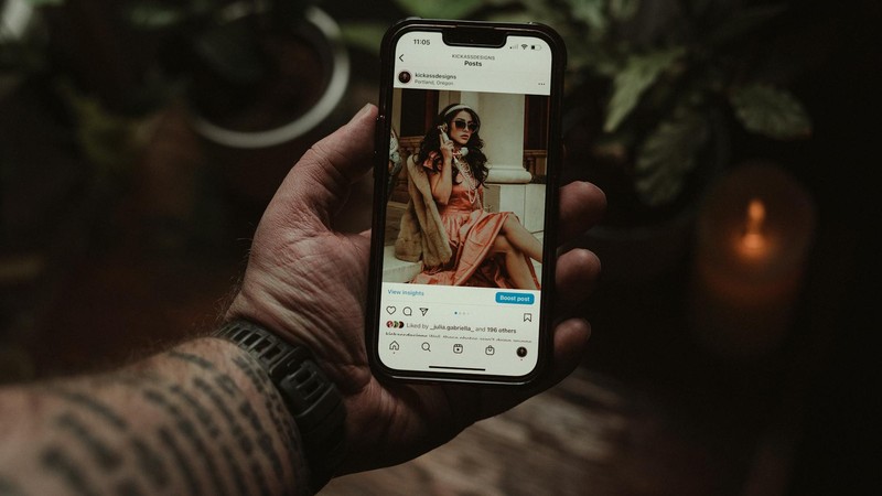
I spent three hours making this gorgeous beaded bracelet. Like, genuinely proud of it — perfect color combination, neat wraps, a cute little charm at the clasp. I snapped a photo with my phone, hit post on Instagram, and waited. Three likes. One from my mom, one from my best friend, and one from my second account that nobody knows about. That was my wake-up call. The bracelet wasn't the problem — the photo was. I spent the next two weeks deep-diving into jewelry photography, watching tutorials, reading blog posts, and experimenting like crazy. The next time I posted a bracelet photo? Three hundred likes. Same bracelet, same phone, totally different approach. Here's everything I learned.
Why Jewelry Photography Is So Ridiculously Hard
Before we get into solutions, let's talk about why jewelry is one of the hardest things to photograph, period.
It's tiny. Most jewelry pieces are smaller than your fist, which means your phone camera — designed for landscapes, faces, and food — is working way outside its comfort zone. You end up cropping and zooming, which destroys image quality fast.
It reflects everything. Metals are essentially mirrors. Gemstones refract light in unpredictable ways. You point a light at your necklace, and suddenly there's a glare blob where the pendant should be. Every lamp, window, and even your phone screen shows up as a reflection on polished surfaces.
Colors don't photograph accurately. That beautiful rose gold looks orange in photos. The amethyst that's clearly purple in person reads as blue-gray on screen. Gold turns greenish under fluorescent lights. Getting accurate color representation is a constant battle.
Backgrounds fight for attention. Your piece is small, which means the background takes up most of the frame. A cluttered table, visible texture, or distracting pattern will overpower your jewelry every time.
Phone photos come out blurry. When you get close to a small object, your phone's autofocus struggles. Your hand moves a fraction of a millimeter, and the whole shot is soft. It's frustrating.
The Gear You Actually Need (It's Not Much)
You do not need a professional camera setup. I've seen incredible jewelry photos shot entirely on a three-year-old smartphone. Here's what actually matters:
A smartphone with a decent camera. Any iPhone from the last 4-5 years or a mid-range Android with a 12MP+ main camera will work fine. The camera quality matters less than how you use it.
A phone tripod. This was my single biggest upgrade. A basic flexible phone tripod costs between $10 and $15 on Amazon, and it eliminates hand shake entirely. No more blurry close-ups. You can frame your shot, lock the tripod, and tap the shutter without touching the phone (or use a 3-second timer). Game changer.
Background surfaces. You don't need anything fancy. White card stock from an office supply store works great for clean, professional shots. A piece of white acrylic (a clear acrylic sheet propped up with white paper underneath) gives you that seamless, floating look. Marble contact paper wrapped around a piece of cardboard creates an expensive-looking surface for about $3.
Lighting. An LED ring light costs $15-20 and provides even, wraparound illumination that reduces harsh shadows. But honestly, natural light is free and often better. If you have a window that gets indirect light, that might be all you need.
A clip-on macro lens. These are tiny lenses that clip over your phone's camera for extreme close-up capability. They cost $5-10 and they're shockingly good for showing texture, individual beads, and tiny details that your phone camera normally can't resolve.
Lighting: The Single Most Important Factor
I'm going to say this clearly: bad lighting cannot be fixed in editing. You can tweak brightness and contrast all day, but if the original photo has harsh shadows, weird color casts, or blown-out highlights, no app is going to save it.
Natural Light Is Your Best Friend
The best jewelry photos I've ever taken were all next to a window. Specifically, a north-facing window (if you're in the northern hemisphere) or any window that gets soft, indirect light. The ideal time is mid-morning (around 10 AM) or late afternoon (around 3 PM) when the light is coming in at an angle rather than straight down.
Avoid direct sunlight hitting your jewelry — it creates harsh, contrasty shadows and blinding highlights on metal surfaces. What you want is side light that wraps around the piece gently. If the sun is too direct, hang a sheer white curtain over the window to diffuse it.
Overcast days are secretly the best for jewelry photography. The cloud layer acts as a giant diffuser, creating soft, even light with virtually no shadows. If it's gray outside, that's your cue to grab your jewelry and start shooting.
Artificial Light Setup
If you can't rely on natural light (maybe you photograph at night, or your workspace has no good windows), here's a basic setup that works:
Use at least two light sources positioned at 45-degree angles on either side of your jewelry. This eliminates the harsh shadows you get from a single light source. LED panels work well because they produce consistent, neutral-colored light. Avoid standard household bulbs — they're usually too warm (yellow/orange) and will mess up your colors.
Add a white reflector (literally just a piece of white foam board or even a white sheet of paper) on the side opposite your main light. This bounces light back into the shadows and fills in dark areas, giving you a more balanced exposure.
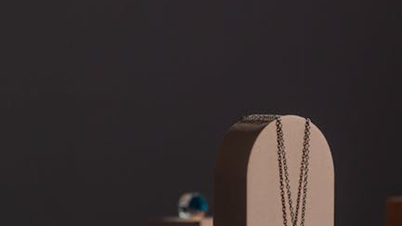
Background Options: What Goes Behind Your Jewelry
The background sets the mood for your entire photo. Here are the most popular options and when to use them:
Pure white: Clean, professional, and perfect for product-focused shots where you want the jewelry to be the absolute star. Best for Etsy listings and product pages. Achieve this with white card stock or a white acrylic sheet.
Light gray: Softer and more elegant than pure white. Gray doesn't compete with jewelry colors the way white sometimes can (especially with silver pieces). It feels premium and modern.
Marble texture: Instantly looks expensive and curated. Marble contact paper is cheap and convincing. Works beautifully with gold jewelry and minimalist designs.
Wood grain: Warm, natural, and approachable. A piece of light oak or birch plywood makes a great photography surface. Best for bohemian, earthy, or handmade jewelry brands.
Dark velvet: If you want your jewelry to really pop, dark backgrounds create maximum contrast. Black or deep navy velvet absorbs light and makes bright gemstones and polished metals look stunning. This is the go-to for luxury and high-end presentations.
Lace or textured fabric: Adds visual interest and a romantic, handmade feel. Works well for vintage-inspired or artisan jewelry. Keep the fabric ironed and smooth — wrinkles in the background are distracting.
Magazine pages or book spreads: For a creative, editorial vibe, photograph your jewelry on top of an open fashion magazine or coffee table book. It's artsy, it's unique, and it tells a story.
Composition: Making Your Shots Interesting
Now that your lighting and background are sorted, let's talk about how to actually frame the shot.
Flat Lay (Top-Down)
This is the most popular style on Instagram right now. You shoot straight down at your jewelry arranged on a surface. The key to a great flat lay is intentional arrangement. Don't just drop the necklace in the middle of the frame. Arrange it in an S-curve, a gentle drape, or a pleasing geometric shape. Leave breathing room — don't fill every inch of the frame.
45-Degree Angle
Shooting from slightly above and to the side shows the three-dimensional quality of your jewelry better than a straight top-down shot. This angle works great for rings (shows the profile and the face of the stone), earrings (shows the dangle and movement), and necklaces (shows how it would lay on a collarbone).
Macro Close-Up
Get in close and show the details your customers can't see in a standard shot. Individual beads, the texture of a hammered metal surface, the faceting on a gemstone, the clasp mechanism, the wire wrapping technique. These detail shots build trust and demonstrate craftsmanship.
Hand Model Shots
Jewelry on a hand or wrist gives buyers a sense of scale and shows how the piece looks when worn. You don't need a professional model — your own hand works fine. Keep nails clean and neutral, remove any distracting jewelry you're not photographing, and use a natural, relaxed pose. Clenched fists look awkward; slightly curved, relaxed fingers look elegant.
Props (With Restraint)
A few carefully chosen props can elevate a jewelry photo from "product listing" to "lifestyle image." Fresh flowers, a cup of coffee, an open book, a paint palette, a piece of nice fabric — these create context and mood. But here's the critical rule: your jewelry is the hero. Props are supporting actors. If the flowers are more eye-catching than the necklace, you've gone too far. One or two props maximum. Three is pushing it.
Editing: Less Is More
You don't need Photoshop. I do all my editing on my phone, and my app of choice is Snapseed (free, by Google). It's powerful, intuitive, and doesn't destroy image quality.
Brightness and contrast: Slightly boost brightness so the jewelry pops, and add a touch of contrast to give metals more definition. Be subtle — you're not trying to make it look like a studio shot, just better than the raw photo.
White balance: This is crucial for jewelry. If your photo looks too yellow (common under indoor lighting) or too blue (common in shade), adjust the temperature until the metal and gemstone colors match what you see in person. Accurate color representation is non-negotiable for jewelry — buyers will return pieces that don't match the photo.
Sharpening: A small amount of sharpening brings out texture and detail, especially in close-up shots. Don't overdo it or the image gets that crunchy, over-processed look.
Filters: Avoid heavy filters. A light, subtle filter is fine for maintaining a consistent feed aesthetic, but if the filter changes the color of your gold, silver, or gemstones, it's working against you. Jewelry buyers are color-sensitive. They need to trust that the sapphire in your photo is actually sapphire blue, not teal.
Instagram-Specific Tips That Actually Move the Needle
Good photos are the foundation, but Instagram has its own rules. Here's what I've learned about turning pretty pictures into actual engagement and sales.
Develop a consistent feed aesthetic. Open your Instagram profile and look at the grid as a whole. Does it look cohesive? If every photo has a different background, lighting style, and editing approach, your feed looks chaotic. Pick 2-3 background colors, a consistent editing style, and stick with it. Consistency builds brand recognition.
Use a preview app. Apps like Preview, Planoly, or UNUM let you arrange your upcoming posts on a mock grid before you publish. This is essential for maintaining that cohesive look and planning your visual content calendar.
Embrace Reels. Static photos still work, but Reels get significantly more reach on Instagram right now. Short videos of jewelry sparkling in light, a time-lapse of you making a piece, a close-up pan across a gemstone — these get attention. You don't need fancy editing. A 7-second clip of a ring catching light as you rotate it can outperform your best photo.
Write captions that tell a story. "For sale 💎 DM to order" is not a caption. Tell people about the piece. What inspired the design? What materials did you use? Where did the idea come from? People buy from people they connect with, and stories create connection. I once wrote a caption about how a customer's grandmother used to wear a similar bracelet, and that post got more engagement than anything else that month.
Use hashtags strategically. Instagram allows up to 30 hashtags per post. Use them — but make them relevant. Mix broad tags like #jewelryphotography and #handmadejewelry with specific ones like #carnelianbracelet or #sterlingsilverearrings. Create a branded hashtag for your business. Research what hashtags your competitors and target audience are using.
Watermark your photos. Jewelry photos get stolen and reposted constantly. Add a subtle watermark — your logo or shop name — somewhere that doesn't obscure the jewelry. Bottom corner, low opacity. It won't stop everyone, but it makes it harder for someone to pass your work off as theirs.
Common Mistakes I Made (So You Don't Have To)
Random fingers in the frame. I can't tell you how many early jewelry photos I took where my fingers were visible, holding the piece or adjusting it. It looks sloppy and unprofessional. Use a stand, a jewelry display, or a piece of putty to hold your pieces in position.
Cluttered backgrounds. In my early photos, you could see my laptop, my coffee mug, a stack of mail, and my cat in the background. Zoom in on the jewelry, clean up the frame, and use a dedicated background surface.
Inaccurate colors. I once posted a photo of a rose gold ring that looked almost orange because of the warm indoor lighting. Multiple people asked if it was "that orange gold." It wasn't. Check your colors before you post. Hold the piece next to your phone screen and compare.
Over-edited photos. In my excitement to make photos "better," I cranked up the saturation, contrast, and sharpness until my jewelry looked like it belonged in a video game. If it looks edited, you've gone too far.
Blurry photos. I was so eager to get close-ups that I'd hold my phone with shaking hands and wonder why everything was soft. Use a tripod. Use the timer. Tap to focus on the exact spot you want sharp. These three habits will eliminate 95% of your blur problems.
Same angle, same background, every single time. Consistency is good. Monotony is not. Even if you maintain a cohesive aesthetic, vary your angles, switch between close-ups and full-piece shots, and rotate through your 2-3 background options.
Ready to Level Up?
Once you've mastered the basics and your Instagram is looking solid, here are a few next steps worth considering:
Get a light box (photo tent). These portable mini studios cost $30-50 and give you controlled, diffused lighting and clean backgrounds. They're especially useful if you photograph a lot of pieces and want consistent results regardless of time of day or weather.
Learn Lightroom. Adobe Lightroom (available on desktop and mobile) is the industry standard for photo editing. The learning curve is steeper than Snapseed, but the color control and editing precision are worth it for serious jewelry sellers.
Create video content. Beyond short Reels, consider making longer-form video content — tutorials on how to style your jewelry, behind-the-scenes of your making process, or educational content about gemstones and materials. Video builds deeper connections with your audience and positions you as an expert, not just a seller.
Going from 3 likes to 300 likes wasn't about buying expensive equipment or becoming a professional photographer. It was about understanding a few core principles — good light, clean backgrounds, steady camera, accurate colors — and applying them consistently. Your jewelry deserves better photos. Now you know how to give it them.
Comments