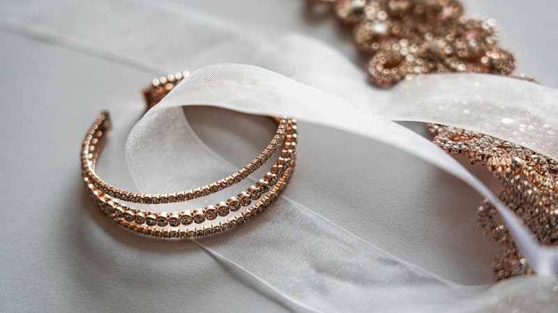
Beaded Necklace Color Guide — 10 Color Combinations That Always Look Good
I started making beaded necklaces about five years ago, and honestly, the hardest part was never the technique — it was picking colors that actually looked good together. I've ruined more strands than I care to admit by mixing colors that seemed fine in my head but clashed on the wire. So I put together this guide based on my own trial and error, plus some principles I picked up from other jewelry makers. Full disclosure: I used AI tools to help organize and refine this article, but every combination and opinion comes from my personal experience at the workbench.
Why Color Matters So Much in Beadwork
Here's the thing about beaded necklaces — the beads are small, so the color has to do heavy lifting. A single strand might have forty, sixty, even a hundred individual beads. Get the palette right, and the whole piece feels cohesive. Get it wrong, and it looks like you grabbed handfuls from random bins.
I learned this the hard way early on. I made a necklace with turquoise, coral, and forest green because I thought "ocean meets forest" sounded poetic. It looked like a craft store exploded on my neck. Since then, I've developed a more practical approach to pairing colors, and these ten combinations are the ones I keep coming back to.
The 60-30-10 Rule (And Why It Works)
Before I get into specific palettes, let me share the one rule that changed everything for me. It's dead simple: your main color takes up about 60% of the beads, your secondary color gets 30%, and an accent color fills the remaining 10%. That's it.
When I ignored this rule and went 50-50 on two colors, the necklace always looked like it couldn't decide what it wanted to be. The 60-30-10 split gives your eye a clear hierarchy. You know what the piece is "about" color-wise, and the smaller portions add interest without fighting for attention.
The other two things I always think about: skin tone and season. Cool blues and silvers pop against warm skin. Earth tones glow on olive complexions. And a chunky berry necklace that looks incredible in November will feel heavy in July. Season matters more than you'd think.
The 10 Color Combinations I Use Over and Over
1. Ocean Breeze — Blue, White, Light Gray
This is my go-to summer combination. I use navy or royal blue as the 60% base, white glass pearls for the 30%, and light gray seed beads as the 10% accent. It works with linen dresses, white t-shirts, basically anything casual.
The trick here is varying the blue shades slightly. If every blue bead is the exact same hue, it looks flat. Mix a couple of blues — one slightly teal, one more purple-blue — and the whole strand comes alive.
2. Earth Warmth — Brown, Beige, Deep Green
When the weather cools down, I reach for this palette constantly. Think brown tiger eye beads, cream-colored freshwater pearls, and matte green Czech glass. It reads as cozy and grounded.
I've found this combination works especially well with longer pendant-style necklaces. The earth tones complement leather, cord, and brass findings beautifully. If you're making something to wear with chunky sweaters, this is your palette.
3. Berry Elegance — Deep Red, Purple, Soft Pink
This one took me a while to get right. The first time I tried mixing red and purple beads, it looked like a Valentine's Day craft project. The secret is keeping the red very deep — almost burgundy — and using the pink sparingly as tiny accent beads.
Garnet, amethyst, and rose quartz is a classic gemstone version of this palette. But glass beads work just as well. Use deep burgundy for your 60%, a muted plum for 30%, and scatter pale pink beads every fifth or sixth position for the accent.
4. Sunset Glow — Orange, Pink, Gold
If you want something that feels energetic and cheerful, this is it. I use warm orange as the dominant color, add a softer blush pink as the secondary, and finish with small gold-plated spacer beads.
This combination screams spring and summer. I've worn it to garden parties, beach trips, even just running errands with a plain white tank top. The gold accents catch sunlight beautifully, which is probably why it gets the most compliments of anything I've made.
5. Forest Walk — Deep Green, Brown, Gold
Similar to the earth palette, but the green takes center stage here. Use deep emerald or forest green for 60%, warm brown for 30%, and gold beads as the sparkle.
I love using natural gemstones for this one — moss agate, wood beads, and brass or gold-filled accents. It has a vintage, almost Victorian feel to it. Great for fall layering with other necklaces of different lengths.
6. Minimalist Clean — White, Gray, Silver
Not every necklace needs to be colorful. This palette is all about restraint. White freshwater pearls, light gray seed beads, and silver spacer beads create something that works with literally everything in your closet.
I make this one as a shorter choker-style strand, usually around 16 inches. It's the necklace I reach for when I'm wearing something bold and don't want my accessories competing. Think of it as the "little black dress" of beaded necklaces.
7. Bohemian Spirit — Red, Orange, Green, Gold
This is the only four-color palette on my list, and it breaks the 60-30-10 rule slightly. I go roughly 40% red, 25% orange, 25% green, and 10% gold. The red still leads, but the orange and green get nearly equal play.
It works because it's the classic boho color story. Think Moroccan markets, Indian textiles, music festivals. I use matte finish beads for this one — glossy beads in this many colors can look cheap. Matte finishes tone everything down and make it feel intentional.
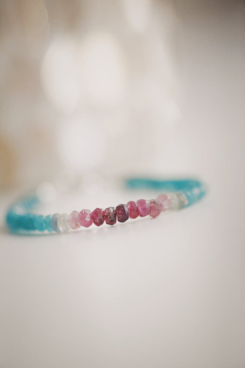
8. Morandi Softness — Dusty Pink, Dusty Blue, Cream White
Morandi colors are those muted, grayish tones named after the Italian painter. In bead form, they create a palette that feels effortlessly sophisticated. The key word here is "dusty" — you want pink and blue with gray undertones, not baby pink or sky blue.
I've found this combination looks especially good with smaller beads — 4mm or 6mm rounds. The muted tones at a smaller scale read as elegant rather than washed out. Pair it with a cream silk blouse and you'll understand why Morandi palettes became so popular.
9. Monochrome Gradient — One Color, Light to Dark
This is less of a combination and more of a technique, but it deserves a spot on the list. Pick one color family — blue, purple, green, whatever speaks to you — and arrange beads from lightest to darkest (or the reverse).
A blue gradient necklace might start with pale aquamarine at the clasp, shift through teal and sapphire, and end with deep lapis lazuli. The effect is surprisingly striking. It looks like you put way more thought into it than you actually did. This is probably the most beginner-friendly approach because you can't really mess it up — as long as the colors flow in one direction, it works.
10. Bold Contrast — Blue + Orange or Purple + Yellow
These are complementary color pairs, meaning they sit opposite each other on the color wheel. Blue and orange. Purple and yellow. They create maximum visual impact, which isn't for everyone — but if you like statement jewelry, this is how you get there.
The balance matters more here than with any other palette. Make the cooler color your 60% base (blue or purple), use the warm color at 30%, and add a metallic or neutral at 10% to bridge them. If you go 50-50 on complementary colors, it can feel aggressive rather than bold.
How Bead Material Changes Everything
I need to mention this because it tripped me up for a long time. The same "red" looks completely different depending on what material you're working with.
Natural gemstones have color variations within each bead — tiny veins, slight shifts in saturation, natural imperfections. This actually works in your favor. Those variations make a monochrome or analogous palette look organic and rich. A strand of all-garnet beads looks interesting because no two garnets are exactly the same shade.
Glass beads are the opposite. They're manufactured to be consistent, so the colors are more saturated and uniform. This is great when you want clean, bold color blocks. Less great when you're trying to create something that feels earthy or natural.
Seed beads (those tiny cylindrical ones) tend to have slightly different color intensity because of how they're made in batches. I actually like this — it adds subtle texture to a design without you having to think about it.
My advice? Don't mix materials with very different color qualities in the same piece. Natural stone beads next to perfectly uniform glass beads can make the glass look fake, or the stone look dull. Pick one material family per necklace and let the colors shine on their own terms.
A Few Mistakes I Made So You Don't Have To
Quick list of things that seemed smart but weren't:
Using too many colors in one piece. Five or more colors almost always looks chaotic. Three is the sweet spot, four works if they're all in the same tonal family. Seven colors is a craft disaster.
Ignoring the clasp color. A silver clasp on a gold-accented necklace, or a bright gold clasp on a pastel strand — these small details can throw off the whole design. Match your findings to your accent color.
Forgetting about the wearer's wardrobe. I once spent hours on a beautiful olive green and mustard necklace that looked amazing on my bead board. Then I realized I didn't own a single thing to wear it with. Think about what's in your closet (or your customer's closet) before committing to a palette.
Start Simple, Then Experiment
If you're new to beaded jewelry, start with the monochrome gradient or the minimalist palette. They're forgiving, they look polished, and they teach you how color flow works on a curved strand. Once those feel comfortable, branch into the bolder combinations.
And keep a notebook. Seriously. I have a small moleskine where I sketch out color patterns and write down what worked and what didn't. Five years in, I still reference it. Color intuition isn't something you're born with — it's something you build, one necklace at a time.
Comments